Grid guides for thumbnails: rules, diagonals, and modules
Grid guides for thumbnails: rules, diagonals, and modules
Grid systems offer a quick scaffolding for thumbnails, helping to place elements and establish rhythm. Different grids encourage different decisions: a rule-of-thirds grid suggests focal tension near intersections, diagonal guides emphasize movement, and modular grids invite repetition and pattern. This note compares these approaches and suggests short exercises that reveal what each grid teaches.
Rule-of-thirds and thirds variants
The rule of thirds divides the page into three equal columns and rows, creating four intersections that often serve as focal points. In thumbnails, a thirds grid helps avoid centering and encourages placement in less literal positions. Variations include weighted-thirds where one interval is larger than the other two, which subtly shifts balance and can be useful for asymmetrical compositions. Thumbnails made on thirds grids tend toward balanced yet lively placements.
Diagonal and dynamic grids
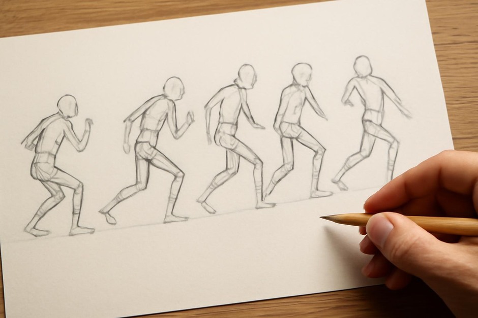
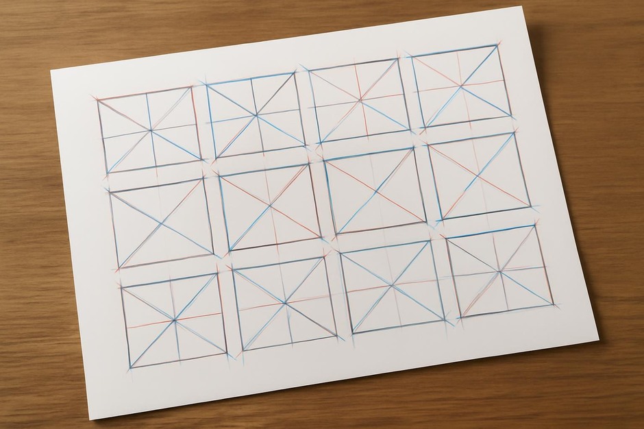
Diagonal guides — single or crossed diagonals — emphasize direction and movement. They are useful when you want to suggest momentum across the thumbnail, guiding the eye along a path. A diagonal grid also quickly reveals whether elements are pitched in a way that supports narrative flow or static rest. In small studies, diagonals help you test the clarity of implied motion with minimal detail.
Modular and column grids
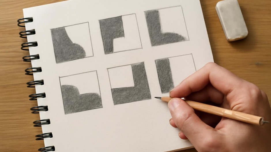
Modular grids divide the page into equal repeating cells and are especially helpful when exploring pattern, rhythm, or repeated motifs. Column grids, where the page is split into narrow vertical bands, help with vertical sequencing and can be effective for studies of rhythm similar to repetition blocks. Modular thinking encourages you to consider adjacency and unit relationships, making it valuable for design-oriented thumbnails and studies that depend on repetition.
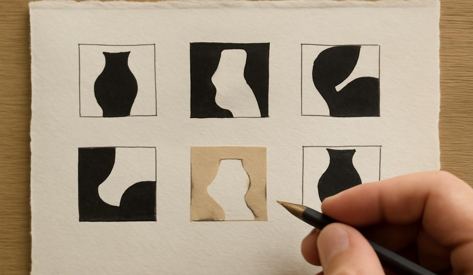
Grids are not rules; they are lenses. The same idea drawn on different grids will reveal different strengths and problems. Using a grid for several thumbnails on the same subject clarifies which compositional devices you naturally favor and where a different guide might produce a stronger result.
Exercises to compare grids
- One-Subject, Four-Grids: Choose a single subject and draw four thumbnails, each on a different grid: centered, thirds, diagonal, and modular. Keep each sketch under 3 minutes and note which grid best supports the subject’s intent.
- Rotate the Grid: Use the same grid but rotate it 45 degrees for the second row of thumbnails. Compare how rotation alters emphasis and directionality.
- Grid-Less Follow-Up: After using a grid, redraw one thumbnail without a grid, trying to retain the compositional logic. Reflect on which elements survived and which dissolved without structural support.
Practical advice: use a light pencil to sketch grids if you plan to erase them, or prepare small pre-gridded sheets for quick sessions. Grids are particularly helpful for constrained practice because they frame the decision space. Over time, you may internalize favored guides and no longer need visible grids, but their training value for distributing elements and testing movement in thumbnails remains useful.