Balancing Weights and Gaps in small sketches
Balancing Weights and Gaps in small sketches
Balance in a composition is a relationship between elements that feels stable or deliberately dynamic. In a thumbnail, balance must be decided quickly. Two common ways to approach this decision are mass-based balancing and axis-based balancing. A third, often overlooked approach, treats gaps and negative space as active counterweights. This note compares those approaches and offers short exercises to feel the differences.
Mass-based balancing
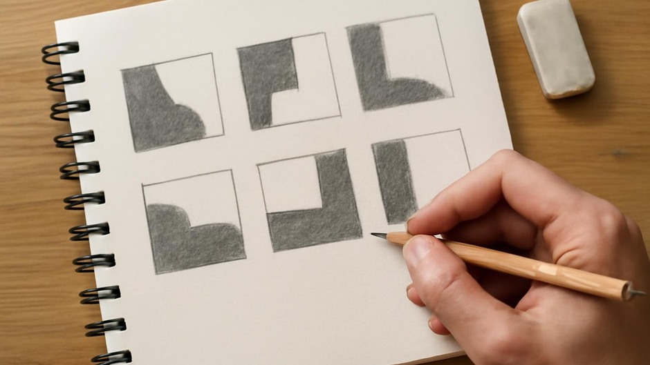
Mass-based balancing asks: where are the visual masses and how do they distribute across the page? Practically, this means simplifying forms to solid tones or silhouettes and adjusting their size and placement until the page reads as comfortable to the eye. In thumbnails you can quickly block in areas of dark and light to test whether a composition feels heavy on one side. This method emphasizes quantity and proximity: larger or denser shapes read as heavier, and nearby small shapes can act as local counterweights.
Axis-based balancing
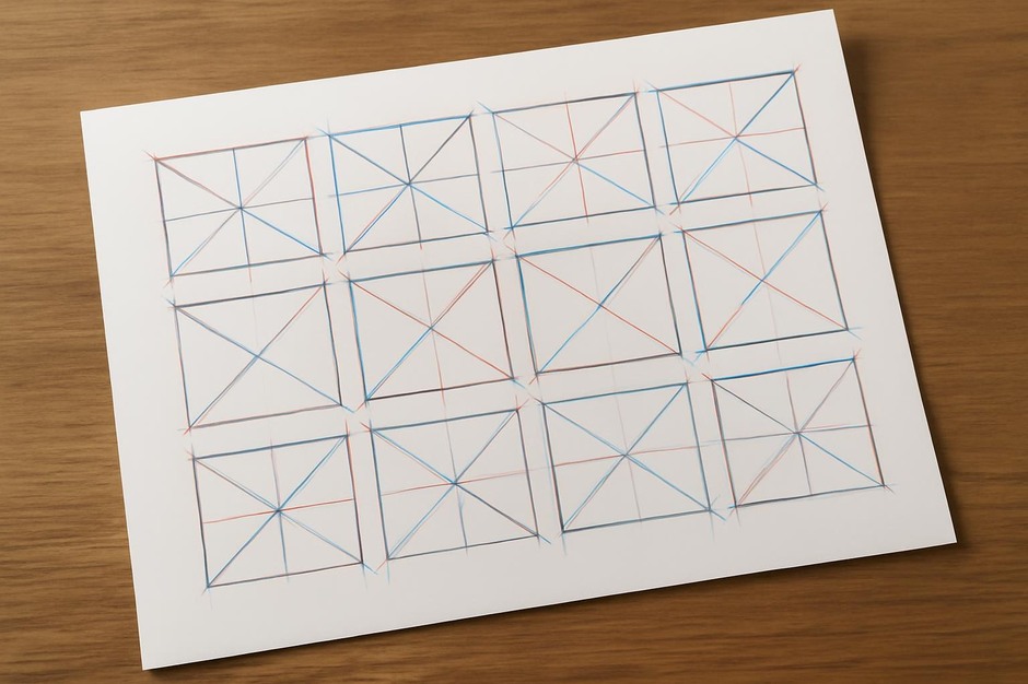
Axis-based balancing begins with an implied line or fulcrum across the page. You might draw a central diagonal, horizontal midline, or vertical spine that organizes elements around a pivot. Balance here is less about equal mass and more about tension around an axis: a large dark form might sit close to the axis while a cluster of smaller shapes sits farther out, creating equilibrium through lever-like distances. This thinking is useful when you want a dynamic but controlled composition, because it permits asymmetry that still feels intentional.
Gaps as counterweights
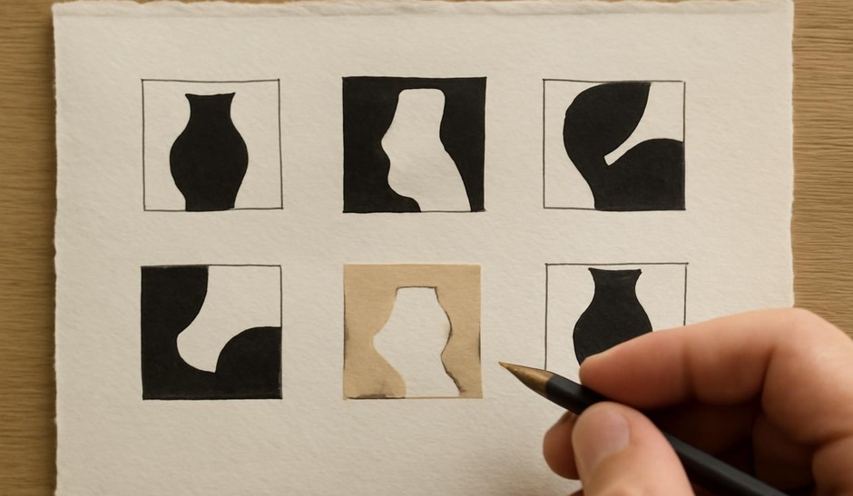
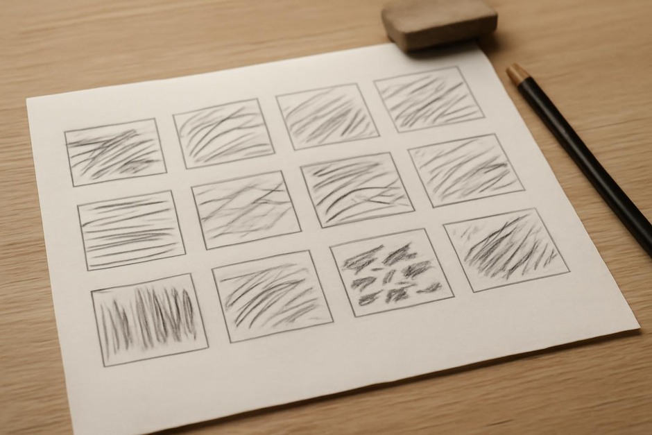
Treating gaps as counterweights reframes negative space as active. Rather than only adjusting shapes, you alter sizes and positions of emptiness to shift perceived weight. A generous void can make a small mark feel heavier by contrast. In thumbnails, you can block open areas with a pale wash, eraser, or even a pencil hatch to see how the absence of mark affects balance. This approach encourages you to think about silence as a compositional force rather than merely background.
These methods are complementary. Mass-based thinking helps with coarse distribution, axis-based thinking offers a structural logic for dynamic layouts, and gap-oriented thinking refines subtle tensions. Practitioners benefit from trying all three in quick succession to understand how each changes the reading of the same subject.
Exercises to compare methods
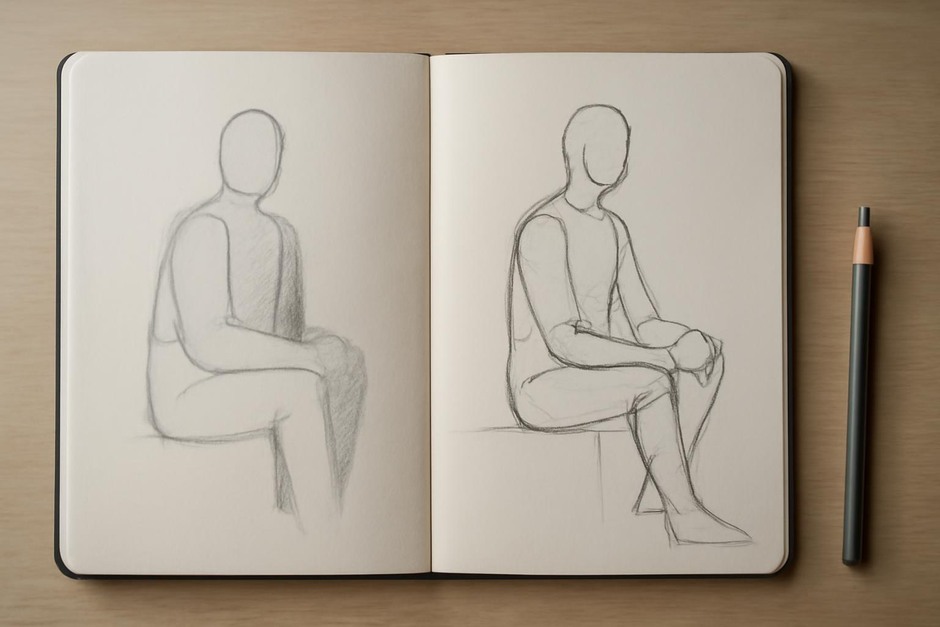
- Single Subject, Three Treatments: Choose one simple subject (a vase, a chair, a figure silhouette). Make three rows of thumbnails: row one with mass blocking, row two organized by an obvious axis, row three emphasizing negative space. Keep each thumbnail under 2 minutes.
- Opposite Swap: Create a thumbnail using mass-based balance. Then, redraw the same composition but keep the shape locations and instead alter only the surrounding gaps. Observe which version feels more stable and why.
- Fulcrum Tests: On a set of four thumbnails, place an axis in a different location for each (center, left third, top-right diagonal, bottom-left diagonal). Adjust elements around those axes and note where asymmetry reads as purposeful rather than accidental.
Small studies make these differences visible more quickly than longer works. They also help you discover personal biases: some artists prefer equalized masses, others are drawn to levered asymmetry, and some find silence to be the most persuasive element. Comparing methods side by side clarifies which adjustments create the balance you want and which merely mask uncertainty. In short, use thumbnails to isolate the variable you want to learn about — mass, axis, or gap — and repeat until the eye registers the intended effect reliably.